A wallet interface can look simple while asking a user to make a consequential decision. “Continue” might mean connect an account, sign a message, approve token spending, or submit a transaction. Those actions should not share an unexplained button label. Good wallet experience design makes the requested authority visible before asking the user to grant it.
This article proposes a review method for teams designing wallet-connected applications. It focuses on wording, state transitions, and the information exchanged between an application and a wallet. It is not a wallet recommendation or a guarantee that an interface is safe. DigitalAssetAPI.com does not connect to wallets, request signatures, or handle private keys.
Separate connection from authorization
Treat account connection as its own interaction. Explain which application is requesting access, which network it expects, and what information it wants to read. After connection, do not imply that the user has also approved future transfers. Each subsequent action should have a distinct purpose, review screen, and opportunity to decline.
For a prototype, make a simple inventory of every wallet prompt. Record the initiating button, the operation requested, the authority granted, and the visible result. A mismatch between those columns is a design defect. For example, a button labeled “View balance” should not lead directly to a request authorizing a third party to spend tokens.
Set a clear safety boundary
Ethereum's security guidance warns against sharing recovery phrases and private keys and describes risks involving malicious approvals and deceptive sites. These are useful baseline concerns for an interface review. A recovery phrase is not an ordinary support credential, and a documentation or support workflow should never ask a user to paste it into a website.
Read the primary reference
Use the Ethereum security and scam-prevention guide as the primary background reference. The review process in the rest of this article is our proposed product-design approach. It adds implementation questions rather than claiming that a checklist can certify a transaction, a wallet, or an application as secure.
Describe the action in ordinary language
Give each prompt a purpose sentence: “Approve this application to request access to the stated token amount” is more informative than “Verify wallet.” Identify the requesting application, the relevant asset, and the scope. Where technical details are available, display them with a readable explanation rather than replacing them with marketing copy.
Do not conceal uncertainty behind a reassuring label. When your software cannot decode a requested operation, state that limitation clearly and make cancellation straightforward. A user should not need to understand a hexadecimal payload to discover that the application cannot explain it. A simulation, when available, is additional evidence rather than a promise about execution.
Keep network and asset identity visible
A familiar token symbol is not enough information for a consequential action. The review should show the network and an appropriate asset identifier, with a way to inspect the full value. Truncation can improve layout, but it should not remove the only means of verifying a destination or contract. Avoid using identical visual treatments for test and production environments.
Consider a fictional user moving a demonstration token between two test accounts. The screen should say that the activity is on a test network, identify the token contract, and show the destination. Do not reuse a production balance display in that scenario. A prototype becomes confusing when its demonstration data looks indistinguishable from a real account.
Distinguish a signature from a completed action
A signature, a submitted request, a broadcast transaction, and an observed result are different milestones. Design the interface around the evidence currently available. “Request signed” should not become “Transfer complete” merely because the wallet dialog closed. The application may still be waiting for submission, network observation, or an additional business decision.
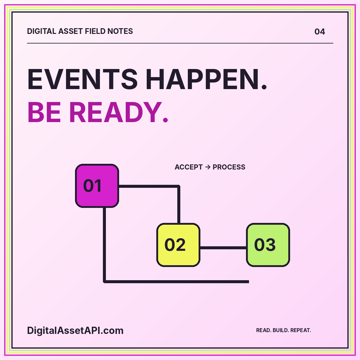
Create a state map before writing button text. In an example transfer flow, you might distinguish draft, awaiting wallet, declined, signed, submitted, observed, and unresolved. These are application labels, not universal network states. Define the evidence required for every transition and keep a record of transitions so support can explain why the interface showed a particular message.
Make decline and interruption ordinary outcomes
A user declining a wallet request is not necessarily an error. They may be checking details, changing accounts, or choosing not to proceed. Return them to a stable review screen with their non-sensitive context intact. Avoid language that pressures them to retry, and never create a second signing request automatically because the first was declined.
Also test interruption. What happens when the wallet application closes, the browser reloads, or the connection drops after signing? The safest interface is one that can reconcile the existing action before encouraging another. Preserve a non-secret action identifier and provide a clear status check path. Do not ask the user to repeat an irreversible operation just to make the spinner disappear.
Explain approvals as ongoing authority
When an operation authorizes later spending, explain its scope instead of describing it as a one-time identity check. Show the spender identity and requested amount where supported. A larger or unlimited allowance should not be buried in expandable fine print. The interface should make the difference between granting authority and exercising that authority understandable.
An approval-management screen should distinguish disconnecting a site from changing an on-chain authorization. Those concepts should not be treated as synonyms. Where your application offers instructions for reviewing permissions, link users to supported wallet documentation rather than inventing an in-page control that does not actually change anything. Never label a cosmetic local setting “Revoke all access.”
Present fees and estimates honestly
An estimate should include the unit and the conditions under which it was calculated. Avoid presenting a precise fiat equivalent without an observation time and valuation source. Where the final fee is not yet known, use language that communicates estimation. Do not imply that a quoted value is guaranteed merely because the design places it inside a prominent card.
For a transfer review, separate the asset amount from the network fee and any application charge. A user should be able to tell what they are sending, what they might spend to submit it, and what the application charges. When one component is unavailable, identify the missing component rather than replacing it with zero or silently removing the row.
Design for accessibility and careful reading
Use plain headings, sufficient contrast, visible keyboard focus, and a logical reading order. Important destination and amount information should remain readable at narrow widths and increased text sizes. Do not communicate safety status through color alone. A yellow badge without a text explanation may be decorative to one user and alarming to another.
Avoid countdowns or motion that pushes users to act before they finish reading. Put the primary action near the details it authorizes, and keep cancellation easy to find. A confirmation screen should be a place to review a decision, not an obstacle course designed to maximize completion rates. Measure comprehension as well as whether users reach the next screen.
Review the entire support journey
A support request should be answerable with a public transaction reference, a safe application request identifier, and a description of the visible state. Do not collect recovery phrases, private keys, authentication tokens, or full session dumps. Give support staff a documented way to redirect users who accidentally offer sensitive information without encouraging further disclosure.
Use the wallet UX checklist during design review and pair it with the custody planning guide when deciding which responsibilities belong to the application. The wallet solution blueprint keeps read-only observations separate from signing. The goal is not to remove every technical detail; it is to make the relevant details understandable before authority changes hands.